Contrast in Pattern Collections
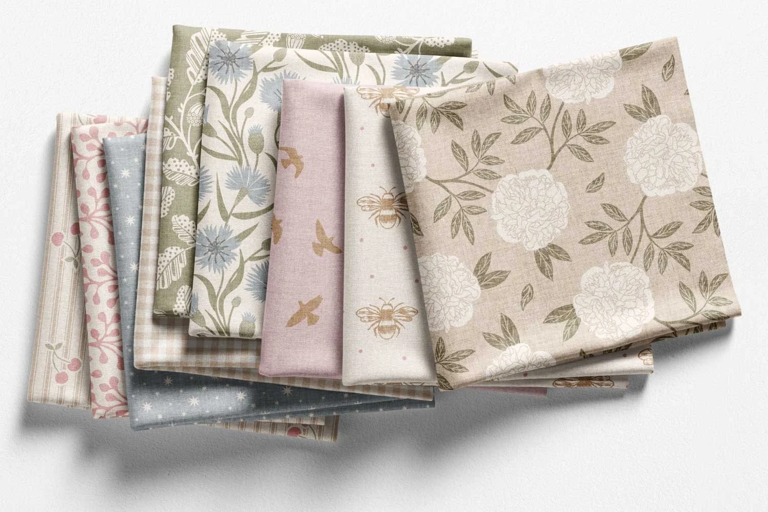
Heirloom Farmhouse, a timeless pattern collection of florals, botanicals, bees, birds, and simple classics in a soft palette
If you’re anything like me, you probably love the thrill of a new idea.
This month, I’ve been trying to resist that pull and instead focus on something much less exciting but valuable: finishing what I started.
On Spoonflower, there’s no pressure to upload a full collection all at once, which makes it incredibly easy to jump to the next collection idea before the current one is fully rounded. And I have a habit of doing just that. It’s a classic case of shiny object syndrome.
So lately, I’ve been revisiting and expanding some of my existing collections (all still very much a work in progress). In doing that, I noticed something important.
Too Many Busy Prints
When I look back at my collections, I can see that I tend to create a lot of dense designs packed with motifs and movement.
What I don’t do as often?
Create space.
Without those quieter, more open designs, it becomes much harder to actually use multiple prints together, whether that’s for interior décor or sewing projects. Everything competes. Nothing gets to breathe.
What Makes a Collection Work
A strong collection isn’t just about having a shared theme or colour palette, though those are important.
It’s also about contrast.
You need enough variation between prints to keep things interesting and usable, while still maintaining cohesion through colour, style, and subject matter.
That balance is what turns a group of individual patterns into a true collection.
What makes this Heirloom Farmhouse collection work is the variation within it. There’s more flexibility when combining prints.
Contrast Isn’t Just Light vs Dark
When we think of contrast, it’s easy to default to dark versus light.
And yes that’s part of it.
But contrast can show up in so many other ways, and exploring those can make your collections far more dynamic and versatile.
Here are a few to consider:
1. Contrast in Formality
Structured, regimented layouts versus loose, free-flowing designs.
2. Contrast in Density
Tightly packed motifs versus open, spacious prints.
3. Contrast in Direction
Multidirectional patterns versus one-way layouts.
4. Contrast in Complexity
Detailed “hero” prints versus simple blenders.
5. Contrast in Scale
Large-scale designs versus smaller, more subtle patterns.
6. Contrast in Colour Variety
Monochromatic palettes versus multi-colour designs.
7. Contrast in Hue
Warm tones versus cool tones.
8. Contrast in Value
Lighter prints versus darker ones (especially the backgrounds).
You Don’t Need All the Contrast
It’s worth saying: your collection doesn’t need to include every single type of contrast listed above.
Some of my collections are monochromatic, and still work well. Here’s an example of one that’s been licensed.
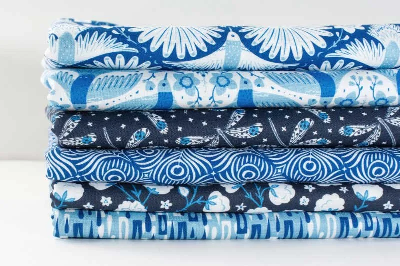
Sapphire Skies, a blue collection featuring birds, blooms, feathers, dragonflies, raindrops, and soft clouds.
The goal isn’t to tick every box.
It’s to thoughtfully introduce enough variation to make your collection:
More visually interesting
Easier to use in real-life applications
Final Thoughts
Right now, I’m still very much in the process of revisiting and refining my own collections.
But even this small shift of paying more attention to contrast has already made a noticeable difference.
And the best part?
There’s no single “right” way to do it.
Your Turn
How do you approach contrast in your pattern collections?
Do you naturally include variety, or are you more like me and tend to lean in one direction?
I’d love to hear how you’re exploring this in your own work.
Join Us!
This topic was covered in my January 2026 Surface Pattern Design Newsletter. Join us inside for monthly insights and free resources.